Your homepage is your storefront.
Do you have curb appeal?
Is your “open” sign on?
What’s that cool thing in your window display?
Can you please fix that Norman door?
Your homepage matters more than any other page on your website, more than almost anything else you might ever do as a marketer. No pressure! This is why storytelling on your homepage is of the utmost importance and why you want to invest as much of your storytelling power as possible to make it snappy, catchy, readable, and explorable.
More than 50 percent of your total website traffic comes through your homepage. It is THE place to drive interest and conversion. It is THE place to tell your best story.
I’ve collected a few homepage guidelines over the years that I’m happy to share with you as you go about crafting your perfect, lovable, clickable homepage.
There are as many different homepages as there are grains of sand on the seashore…or at least it seems that way. So while the advice in this newsletter will not be exhaustive of all the ways to tell your homepage story, it’s at least a starting point for anyone looking to up their story game.
Here we go!
A homepage storytelling formula
Part of the beauty of unique homepages is that they don’t all follow the same formula. But I know how helpful formulas can be!
Here is one of the most common and successful ones I’ve used over the years. Use it as a starting point. Feel free to break the rules often!
Section One: Who You AreThis should contain:
Your primary benefit (headline) – catchy, snappy, with your unique voice and tone
Your product category (subhead) – what it is you actually do
Images or video that make people feel things (first and foremost) and learn things (this is optional but appreciated)
Buttons for what to do next / how to engage further
Section Two: Social proof that shows how people and companies feel about you
Section Three: “We get it / we get you”
Section Four: Why we exist / how we’re different
The rest: A bunch of other cool stuff we’re about
Essentially the story breaks down into an overview of who you are as a company, how you relate to others, what you know about your people, why you care about these problems / these people, and what you’re doing about it.
Some of the best online copywriting keeps the reader at the forefront. So the nice thing about this formula is that it’s mostly about “them,” your reader. The formula goes: You (through the lens of helping Them) → Them → Them → You → You.
Homepage storytelling inspiration
Start here: Your brand story
Your homepage is the page that is seen by the most people and experienced through the most broad set of expectations and context. People come to the site from all sorts of places with varying degrees of knowledge about who you are.
That’s why it’s important to make a first impression that aligns to the core of who you are as a brand.
This can happen a number of different ways, including:
In the words you use
In your brand voice and tone
In your homepage visuals (photo or video)
When it comes to your homepage story, you’ll want to pick and choose one or more of these elements to nail in this top hero section, which is the first part above the “fold” that everyone sees before scrolling:
The primary benefit you provide to people
The name of your product category
The next step you want someone to take with you
The next step doesn’t always need to be a signup button…but probably 95 percent of the time it will be. You want your headlines and copywriting to incentivize people to take another action, to engage one step further. Most often this will mean having a visitor jump into the product and experience what you have to offer—for software companies, this is how Product-Led Growth works, and for consumer brands this is how you drive e-commerce sales.
But the “next step” can also be:
Keep scrolling to read more
Watch this cool video we made
Tell us more about yourself in a survey or waitlist or email capture
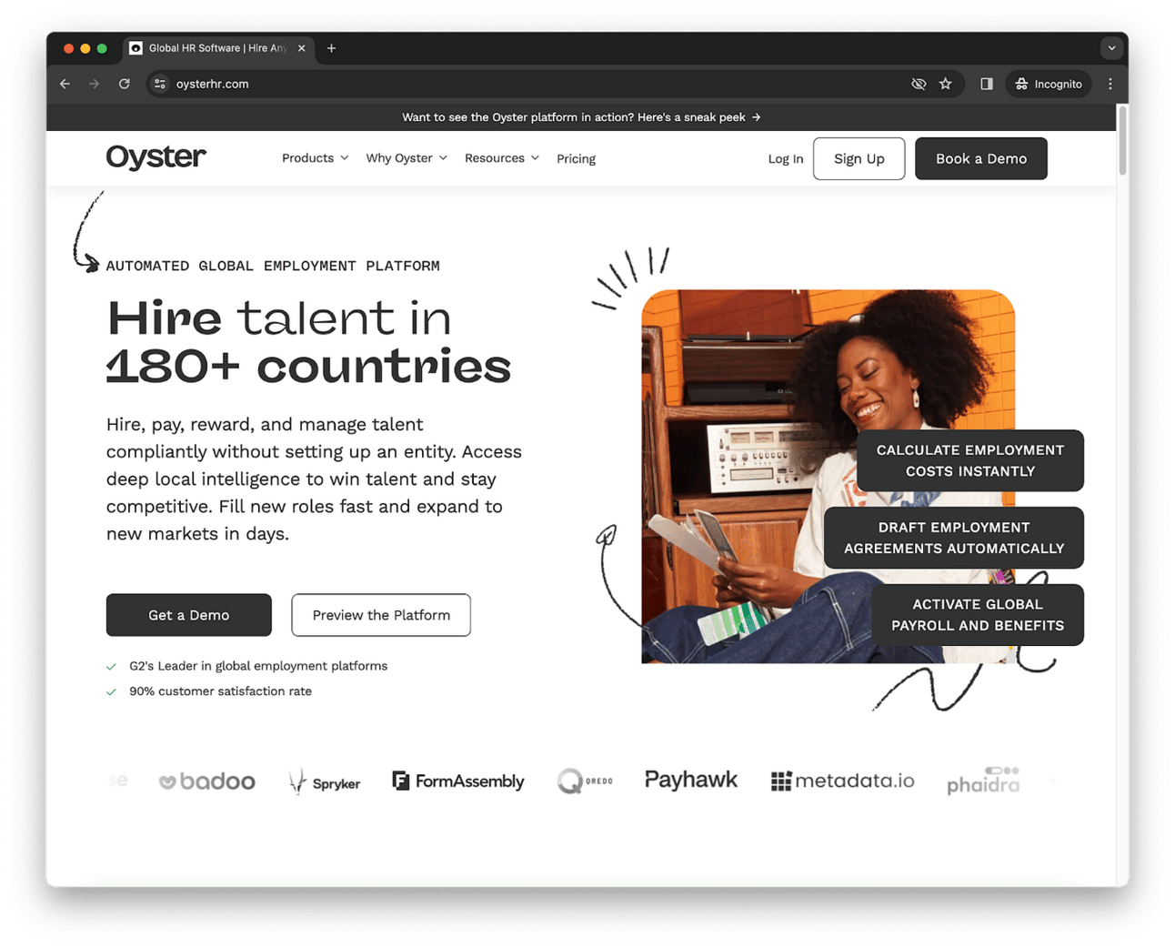
Example: On the Oyster homepage, you learn not only that the company helps with global employment (thanks to the words) but also that they are a brand that cares about real people, global puzzles, and likes to have a little fun (thanks to the visuals).

Example: On the Zeck homepage, the copy makes it very obvious what the story is all about—make board meetings less painful. They also use copy to bring in some whimsy beneath the enormous headlines. (Speaking of enormous, please ignore the enormous headshot of actor Edward Norton below the scroll; he’s a co-founder of Zeck.)

Try a curiosity gap
Some of the best storytelling keeps you guessing.
A curiosity gap is one of the tried-and-true copywriting tactics that you often see in email subject lines or blog post headlines. There are heavy-handed, manipulative curiosity gaps (“Is office air conditioning a sexist conspiracy?”) but there are more temperate, strategic curiosity gaps that don’t leave the reader feeling used and abused.
Remember: you want people to want to keep reading, not to feel extorted into scrolling or clicking.
This type of curiosity storytelling can be accomplished with words or with design. I hesitate to give design advice, so please consult a design professional, but I know enough to be dangerous and to say that the placement of arrows and buttons and images that peek here and there as you scroll—even parallax scroll effects—all do a wonderful job of pulling a reader further down the page.
Words are my favorite curiosity creators, though. Be it an actual question or just a teaser of an introduction, words themselves can often be incentive enough to scroll more or click through.
Example: On the Daydream homepage, there are no giant buttons to click underneath the headings. There’s a very curious statement about “this dream we keep having” and apparently we’re in it (?!) and then an arrow inviting us to scroll.

(Note: The Daydream website has had a makeover since. The current website is here. It contains no curiosity gap, but there is some swearing!)
Say less
One of my favorite blog post hacks is to write my introduction, then go back and remove the first paragraph. The intro rarely suffers from it and usually is improved by it!
Same thing goes when I’m writing website copy. Typically the first thing that I’ve written down is not necessary for the page to still be coherent and successful. Startup advisor Steve Blank calls the phenomenon of over-talking on a website “happy text.” To paraphrase Steve, “Death to ‘happy text!’”
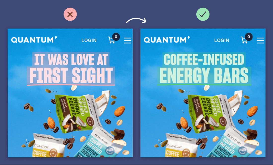
Often this can be accomplished on a website by swapping out a verbose heading with a snappy tagline. In fact, taglines—which are often used in ad copy or campaigns—make great headlines for websites.
Example: Some of the best “say less” / “say better” web writing advice comes from Harry Dry who archives all sorts of interesting marketing examples. Here are a couple from his landing page archives, which point out the value of benefit statements and the horror of flowery prose:

Say more, but in a video
If you do have to say more, then do it in a format that everyone loves to binge: video!
Many ambitious brands are eschewing the website-scroll altogether and doing all the storytelling heavy-lifting in an embedded video that comes right after their main headings. Not only can video be an engaging format, it can also pack a lot of product description plus brand personality into a short snippet.
Of course, the biggest hurdle here is the quality bar. You can’t just whip up a fancy video in an afternoon; you’re typically looking at a monthslong process and $10,000 or more in budget. But the payoff on a homepage can be huge, and the replay value of a video is significant also—you can re-post on YouTube, share on social media, link from emails…you name it!
Example: On the Descript homepage, they have a wonderfully produced short video (one minute) that is eye-catching but also very, very informative. I landed on the page feeling neutral; I left the page having created an account. And I never even read the headline!

Show, don’t tell—but with words!
There are a lot of compelling websites that try their hardest to get you into the customer experience as fast as possible so that you can experience the value of what they’re selling. They’ll ask you to start demos, or they’ll list all the shopping links, or they’ll wax poetic about features.
What I find most interesting, though, is when you can show someone the core value of your product with a quick-and-easy story, all from the homepage.
This might take some extra ingenuity—see our previous Kumbaya newsletter posts about boosting your creativity—but the payoff is spectacular.
Example: On the Amie homepage, this all-in-one to-do list and email and calendar tool shows you a preview of all the different ways you might interact with Amie throughout the day, filled with real-life information and screens—and all you have to do is scroll.

Example: On the Rocket homepage, the full product is on display. Rocket is an emoji-picker shortcut tool where all you have to do is type a colon, in any program or app, and your full range of emoji are available. Rocket tells this story as simply and effectively as can be—with someone typing 👋 and then typing a 🚀.

Over to you
What are some examples of great storytelling you’ve seen on the web lately?
It’d be great to hear your perspective.
For more…
Follow us on LinkedIn and on Instagram. Stay tuned to our Substack space for new community features and ways to meet your fellow subscribers.
1:1 coaching and mentorship
Team workshops and consulting for marketing and leadership
Speaking and appearances on podcasts and at events